Navy and Black Together: Use Texture and Separation to Read the Combination
Navy and black can sit close together in value, so their difference may look clear in daylight and subtle indoors. Treat the pairing as a design experiment. Compare textures, visible boundaries and one optional lighter detail rather than following a rigid colour prohibition.
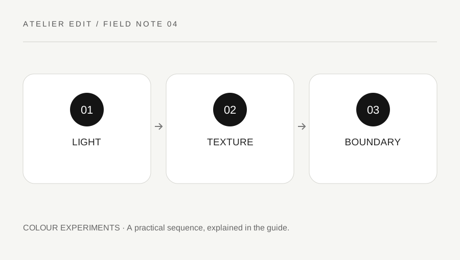
Original explanatory diagram. Examples illustrate a method or decision; they are not claims of personal testing.
Look at the actual shades
Place the navy and black garments together in daylight and in the lighting where you expect to wear them. Navy varies from visibly blue to almost black. The combination's effect depends on those actual fabrics, not only the colour names on their labels.
Decide whether you like a subtle tonal relationship or want the two pieces to appear clearly separate. Both are reasonable intentions. A photograph can exaggerate or flatten the distinction, so compare the physical garments too. Avoid treating one phone image as a precise colour measurement.
Use texture to create a boundary
A matte knit beside smooth trousers can remain readable even when the colours are close. A woven jacket, ribbed top or denim surface adds another kind of distinction. Start with one texture contrast and look at the full outfit rather than collecting several decorative effects.
If both garments have similar smooth surfaces and very close shades, the result may feel almost monochrome. You can keep that quiet effect or introduce a clearer boundary through the hem, an open layer or a small contrasting item. These are editorial options, not rules that the colours require correction.
Add a small light element only if useful
A pale shirt edge, white trainer or lighter scarf can make the dark combination easier to read. Choose one and compare before adding another. A small detail may be enough; a whole new palette is not necessary.
Check the practical fit of the chosen accessory or shoe and whether it suits the setting. Colour coordination should not override comfort, weather needs or a dress requirement. Keep existing pieces as the starting point and avoid assuming a near match is a problem that needs shopping to solve.
Build a three-piece comparison
Try navy trousers, a black knit and your usual shoes. Compare that base with a pale shirt collar visible beneath the knit, then with the collar concealed. Notice whether the lighter edge helps the outfit you want or distracts from its quiet outline.
Record the actual shades and textures that worked, since another navy garment may behave differently. The useful lesson is about these pieces under these conditions. It is not proof of a universal colour law or a report of current fashion demand. A deliberate pairing becomes easier when you can explain the intended relationship instead of worrying whether the colour names are officially allowed together.
Keep the lighting comparison simple
Place the two garments together near ordinary daylight, then view the completed outfit under the indoor lighting you normally use. Note whether the navy remains visibly blue or reads almost black. Do not alter a photograph's colour settings while deciding how the physical garments relate.
Try one optional boundary, such as a lighter collar edge, and compare again with everything else fixed. If the texture difference already gives the separation you like, the additional detail may be unnecessary. Check the side and back as well as the front, especially when a layer covers most of one colour. Record the actual garments and lighting context rather than declaring that every navy-and-black combination works identically. A quiet close pairing can be intentional, while a clearer blue-black distinction can also be intentional. The comparison is complete when you can describe the effect you chose and the practical outfit remains comfortable for its real setting.
A practical checklist
Choices are saved in this browser. Reset them here or clear this site’s browser storage.
Questions that come up
Is navy with black forbidden?
No universal prohibition is needed. Compare the actual fabrics, light and intended effect. A subtle dark pairing and a more separated one are both possible editorial choices.
Why does navy look black in a photo?
Lighting, exposure and fabric can reduce the visible distinction. Check the garments directly in the relevant environment rather than relying only on a phone image.
Do I need a white accessory?
No. A lighter detail is one optional way to create contrast. Keep it only if it helps the outfit you want.
References & scope
Background references checked on 18 October 2026. Worked examples and diagrams are original teaching material.